Hey there! Are you interested in visualizing your Search Console data in Looker Studio? In this episode of Search Console Training by Google Search Central, Daniel Waisberg shares valuable tips on monitoring website search traffic using Looker Studio, previously known as Data Studio. He details data visualization and how it can help you find and address real-time issues. With Looker Studio, you can enrich your Search Console data and create informative dashboards for your website. So, to level up your search traffic monitoring game, keep watching!
Understanding Looker Studio
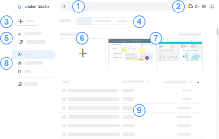
Defining Looker Studio
Looker Studio is a data visualization and analytics platform that allows users to create and share visually appealing dashboards and reports. It provides a user-friendly interface that makes it easy for individuals and teams to explore, analyze, and present complex data sets.
Differentiating between Looker Studio and Google Data Studio
Looker Studio and Google Data Studio are data visualization tools, but their features and functionalities differ. While Google Data Studio is a free tool for beginners and non-technical users, Looker Studio is a more robust and advanced platform offering additional data analysis, integration, and collaboration capabilities. Looker Studio provides more customization options and supports more data sources than Google Data Studio.
Important features of Looker Studio
Looker Studio offers several important features, making it a powerful data visualization and analysis tool. Some key features include:
- Customizable Dashboards: Looker Studio allows users to create personalized dashboards by choosing from various visual elements, such as charts, graphs, and tables. Users can customize the appearance and layout of their dashboards to suit their specific needs.
- Data Exploration: With Looker Studio, users can easily navigate large datasets and explore the data visually and intuitively. The platform offers interactive tools and filters that enable users to drill down into the data and uncover valuable insights.
- Collaboration: Looker Studio facilitates collaboration among team members by allowing them to share dashboards, reports, and analyses. Users can set permissions and access levels to control who can view and edit the shared content.
- Data Integration: Looker Studio supports integration with various data sources, including databases, cloud storage platforms, and third-party applications. This integration allows users to consolidate data from multiple sources and analyze it in a centralized location.
- Advanced Analytics: Looker Studio offers advanced analytics capabilities, such as predictive modeling, machine learning, and data forecasting. These features enable users to analyze complex data and make data-driven business decisions.
Importance of Data Visualization in Looker Studio
Highlighting the need for visualization
Data visualization is crucial in understanding complex datasets and communicating insights effectively. By presenting data visually, Looker Studio helps users easily identify patterns, trends, and outliers in their data. Visualizations enable users to grasp information quickly and make informed decisions based on the insights derived from the data.
The role of visualization in analytics
Data visualization is an essential component of the analytics process. It helps analysts and stakeholders better understand the data by visually representing it meaningfully. Looker Studio offers a wide range of visualization options, such as bar charts, line graphs, scatter plots, and heatmaps, which allow users to explore data from different angles and perspectives.
Advantages of using Looker Studio for data visualization
Looker Studio provides several advantages when it comes to data visualization:
- Interactive Visualizations: Looker Studio allows users to interact with their visualizations, enabling them to explore the data further by zooming in, filtering, and selecting specific data points. This interactivity enhances the user experience and facilitates a deeper understanding of the data.
- Real-time Updates: Looker Studio enables users to create real-time dashboards automatically updating as new data becomes available. This feature ensures that users always have access to the most current information without manually refreshing the data.
- Customization Options: Looker Studio provides a wide range of customization options for visualizations. Users can tailor their visualizations’ appearance, layout, and formatting to align with their branding, reporting requirements, and personal preferences.
- Storytelling Capabilities: Looker Studio offers storytelling features that allow users to create narratives around their data. Users can incorporate annotations, text boxes, and images into their dashboards to provide context and tell a compelling data-driven story.
- Collaboration and Sharing: Looker Studio makes sharing visualizations and dashboards with colleagues, stakeholders, and clients easy. Users can publish and distribute visualizations, embed them in other platforms, and set permissions to control access levels.
These advantages make Looker Studio a powerful data visualization and analysis tool, enabling users to derive valuable insights from their data and effectively communicate them to others.

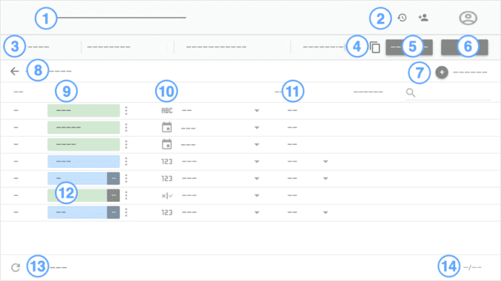
Integrating Search Console with Looker Studio
Steps to connect Search Console to Looker Studio
Integrating Search Console with Looker Studio allows users to analyze and visualize search traffic data in a centralized location. The following steps outline how to connect Search Console to Looker Studio:
- Access Looker Studio: Log in to your Looker Studio account and navigate to the administration settings.
- Create a Data Source: Click on “Add a Connection” and select “Search Console” as the data source. Follow the prompts to authorize Looker Studio to access your Search Console account.
- Configure Data Connection: Provide the credentials and permissions to establish the connection between Search Console and Looker Studio. Select the desired metrics and dimensions you want to analyze in Looker Studio.
- Verify Data Connection: Test the connection to ensure Looker Studio can retrieve data from the Search Console successfully. Make any necessary adjustments or troubleshoot any issues that may arise.
- Create Dashboards and Visualizations: Once the data connection is established, you can build dashboards and visualizations in Looker Studio using the Search Console data. Customize the appearance, layout, and filters to create meaningful and insightful visualizations.
Benefits of integrating Search Console with Looker Studio
There are several benefits to integrating Search Console with Looker Studio:
- Centralized Data Analysis: By integrating Search Console with Looker Studio, users can analyze search traffic data alongside other datasets within a single platform. This centralization simplifies the analysis process and gives users a comprehensive view of their website’s performance.
- Customizable Dashboards: Looker Studio allows users to create customized dashboards and reports using Search Console data. Users can organize and present the data to suit their needs and preferences.
- Advanced Analytics: Looker Studio offers advanced analytics capabilities, such as predictive modeling and machine learning algorithms. Users can leverage these advanced analytics features to extract deeper insights and make data-driven decisions by integrating Search Console data with Looker Studio.
- Collaboration and Sharing: Looker Studio allows users to share dashboards and visualizations with internal team members or external stakeholders. This feature facilitates collaboration and enables users to communicate insights effectively with others.
- Real-time Updates: When Search Console data is integrated with Looker Studio, users can configure their dashboards to update in real time. This ensures that the displayed data is always current and reflects the latest changes in search traffic.
The integration of Search Console with Looker Studio enhances the capabilities of both platforms and provides users with a powerful tool for analyzing and visualizing their search traffic data.
Exploring the combined features of Search Console and Looker Studio
The integration of Search Console with Looker Studio brings together the strengths of both platforms, allowing users to analyze and visualize their search traffic data in a comprehensive and user-friendly manner.
With Looker Studio, users can create customized dashboards that aggregate search console data alongside other relevant datasets for a holistic view of their website’s performance. The platform offers various visualization options, allowing users to explore the data from different angles and perspectives.
Looker Studio’s advanced analytics capabilities further enhance the analysis of search console data. Users can leverage machine learning algorithms and predictive modeling to uncover insights and trends not immediately apparent from the raw data.
Additionally, Looker Studio’s collaboration and sharing features enable users to easily share their dashboards and visualizations with team members and stakeholders. This facilitates collaborative data analysis and decision-making processes.
Overall, the combined features of Search Console and Looker Studio provide users with a comprehensive solution for monitoring and analyzing search traffic data, empowering them to derive valuable insights and make data-driven decisions.
Google Search Monitoring Dashboard
Explaining the Google Search monitoring dashboard
The Google Search monitoring dashboard in Looker Studio provides a centralized location for monitoring and analyzing search traffic data from Google Search Console. The dashboard presents key metrics and visualizations that help users understand the performance of their website in search results.
The dashboard typically comprises different components, including filters, charts, tables, and metrics. Users can customize the layout and appearance of the dashboard to suit their specific needs and preferences.
Interpreting the metrics on the dashboard
The metrics displayed on the Google Search monitoring dashboard in Looker Studio provide insights into a website’s performance in search results. Some common metrics that users can expect to find on the dashboard include:
- Impressions: This metric represents the number of times a website’s pages appeared in search results.
- Clicks: Clicks indicate the number of times users clicked on the website’s pages in search results.
- Click-through Rate (CTR): CTR is the percentage of users who click on a website’s pages after seeing them in search results. It is calculated by dividing the number of clicks by the number of impressions.
- Average Position: Average Position indicates the average rank of a website’s pages in search results. A lower average position indicates a higher ranking.
These metrics provide users with valuable information about their website’s visibility, click-through rate, and average performance in search results. By analyzing these metrics over time, users can identify trends, patterns, and areas for improvement.
Understanding the dashboard’s functionality within Looker Studio
The Google Search monitoring dashboard in Looker Studio offers several functionalities that enhance the analysis and monitoring of search traffic data. Some key functionalities include:
- Filter Options: Looker Studio provides various filter options that allow users to narrow down the data displayed on the dashboard. Users can filter by date, specific web pages, countries/regions, devices, and other relevant dimensions.
- Interactive Charts: The dashboard’s charts are interactive, enabling users to explore the data further by zooming in, hovering over data points, and selecting specific elements. This interactivity enhances the user experience and facilitates a deeper understanding of the data.
- Real-time Updates: Looker Studio allows users to configure their dashboards to update in real time. This means that the data displayed on the dashboard automatically refreshes as new data becomes available in the Google Search Console.
- Anomaly Detection: Looker Studio can incorporate anomaly detection algorithms that identify unusual patterns or changes in the data. This helps users detect and investigate potential issues or opportunities related to their website’s performance.
These functionalities make the Google Search monitoring dashboard in Looker Studio a powerful tool for analyzing, monitoring, and optimizing a website’s performance in search results. Users can gain valuable insights into their website’s visibility, user engagement, and overall search performance by utilizing the features and functionalities offered by the dashboard.
Data Enrichment within Looker Studio
Ways to enrich Search Console data in Looker Studio
Looker Studio allows users to enrich Search Console data by integrating it with additional datasets and sources. Some ways to enrich Search Console data within Looker Studio include:
- Data Blending: Looker Studio supports data blending, which enables users to combine Search Console data with data from other sources, such as Google Analytics or CRM systems. This integration provides a more comprehensive view of website performance and user behavior.
- External Data Sources: Looker Studio allows users to import external data into their dashboards and reports. Users can incorporate data from third-party sources, industry benchmarks, or internal proprietary data to enrich the analysis and provide additional context for the Search Console data.
- Calculated Fields: Looker Studio offers the ability to create calculated fields based on existing data within the Search Console. Users can define custom metrics or dimensions that refine the analysis and provide additional insights.
By enriching Search Console data within Looker Studio, users can gain a deeper understanding of their website’s performance and identify opportunities for improvement.
Importance of data enrichment
Data enrichment is crucial for gaining a comprehensive and accurate understanding of website performance. By integrating various datasets and sources, users can contextualize the Search Console data and uncover insights that may not be apparent from a single data source alone.
Enriched data provides a more holistic view of website performance, allowing users to make informed decisions based on a broader range of information. Users can identify correlations, trends, and patterns that lead to actionable insights and improvements by considering multiple perspectives and dimensions.
Examples of enriched Search Console data
Here are some examples of how Search Console data can be enriched using Looker Studio:
- Combining Search Console data with Google Analytics data: By blending Search Console data with Google Analytics data, users can analyze website performance across different dimensions, such as organic traffic, page load times, and bounce rates. This integration provides a more detailed understanding of user behavior and engagement.
- Incorporating industry benchmarks: Users can import them into their Looker Studio dashboards to compare their website’s performance to industry standards. This enrichment provides valuable context and allows users to identify areas where their website may be underperforming or excelling relative to their industry peers.
- Integrating demographic and geographic data: By incorporating demographic and geographic data into their analysis, users can gain insights into the specific target audiences that engage with their website. This data enrichment enables users to tailor their marketing strategies and content better to meet the needs and preferences of their target demographics.
These examples illustrate how data enrichment within Looker Studio can provide a more comprehensive and insightful analysis of Search Console data. Users can unlock valuable insights and make data-driven decisions to optimize their website’s performance by leveraging additional datasets and sources.
Visualizing Search Console Data
Methods to visualize Search Console data in Looker Studio
Looker Studio offers various methods to visualize Search Console data, allowing users to explore and understand the data in a visual format. Some common visualization methods available in Looker Studio include:
- Line Charts: Line charts are commonly used to display the trend or change in a metric over a specific time period. In Looker Studio, users can create line charts to visualize metrics such as impressions, clicks, and click-through rates over time.
- Bar Charts: Bar charts effectively compare metrics across different categories or dimensions. Users can create bar charts in Looker Studio to compare metrics such as impressions or clicks across web pages, countries/regions, or devices.
- Scatter Plots: Scatter plots are useful for identifying relationships or patterns between two variables. Looker Studio allows users to create scatter plots to visualize the correlation between metrics, such as impressions and average position, or clicks and click-through rates.
- Heatmaps: Heatmaps visually represent the density or concentration of data points. Users can create heatmaps in Looker Studio to analyze the distribution of metrics, such as impressions or clicks, across different dimensions, such as web pages, countries/regions, or devices.
These visualization methods can be customized in Looker Studio to suit specific needs and preferences. Users can adjust formatting options, apply filters, and combine multiple visualizations on a single dashboard to comprehensively understand the Search Console data.
Interpreting visualized data
Interpreting visualized data in Looker Studio requires considering the visualization’s context, patterns, and relationships. Here are some key aspects to consider when interpreting visualized Search Console data:
- Trends Over Time: Look for patterns or trends in line charts to identify metrics changes over a specific period. Are there any notable increases or decreases? Have there been any significant fluctuations or seasonal patterns?
- Comparisons: In bar charts, compare metrics across different categories or dimensions to identify variations or discrepancies. Are there any standout performers or underperformers? What factors may contribute to these differences?
- Correlations: Analyze scatter plots to determine any relationships or correlations between metrics. Do higher impressions lead to higher clicks? Is there a correlation between average position and click-through rate?
- Concentration or Distribution: Examine heatmaps to understand the distribution or concentration of metrics across different dimensions. Are certain web pages or countries/regions generating more impressions or clicks? Are there any outliers or clusters?
By critically analyzing visualized Search Console data in Looker Studio, users can extract meaningful insights, identify actionable trends, and make data-driven decisions to optimize their website’s performance.
Examples of visualized Search Console data
Here are some examples of visualized Search Console data in Looker Studio:
- Line Chart Example: A line chart visualizing impressions, clicks, and click-through rates over time can reveal trends and identify increased or decreased user engagement periods.
- Bar Chart Example: A bar chart comparing impressions and clicks across different web pages can help identify which pages drive the most or least traffic.
- Scatter Plot Example: A scatter plot showing the relationship between average position and click-through rate can indicate whether a higher ranking leads to increased user engagement.
- Heatmap Example: A heatmap displaying impressions across different countries/regions can highlight geographical variations in website visibility and identify areas of opportunity or focus.
These are just a few examples of how visualized Search Console data in Looker Studio can provide valuable insights and guide users in optimizing their website’s performance.
Monitoring Dashboard
Building a monitoring dashboard in Looker Studio
Building a monitoring dashboard in Looker Studio involves creating a centralized location to track and analyze key metrics and trends related to website performance. Here are the steps to build a monitoring dashboard:
- Identify Key Metrics: Determine the key metrics relevant to your website’s performance. These may include metrics such as impressions, clicks, click-through rates, average position, and others.
- Create Visualizations: Use Looker Studio’s visualization tools to create charts, graphs, and tables representing the selected metrics. Customize the appearance and formatting of the visualizations to align with your reporting needs and preferences.
- Set up Filters: Set up filters in Looker Studio to allow users to interact with the dashboard and customize the displayed data. Filters can include date ranges, specific web pages, countries/regions, devices, or other relevant dimensions.
- Configure Auto-Refresh: Configure the monitoring dashboard to automatically refresh at regular intervals or in real time to ensure that the displayed data is always up to date.
- Share and Collaborate: Share the monitoring dashboard with relevant stakeholders, such as team members or clients, using Looker Studio’s sharing and collaboration features. Set permissions to control access and editing capabilities.
- Monitor and Analyze: Regularly review and analyze the data on the monitoring dashboard to track performance, identify trends, and make data-driven decisions.
By building a monitoring dashboard in Looker Studio, users can centralize and streamline the monitoring and analysis of key metrics related to website performance. The dashboard provides a comprehensive overview of the website’s health and allows for efficient monitoring and optimization efforts.
Role of monitoring dashboard in analyzing Search Console data
A monitoring dashboard in Looker Studio is crucial in analyzing Search Console data by providing a centralized location for tracking key metrics and monitoring trends. The dashboard allows users to:
- Track Performance: Users can monitor metrics such as impressions, clicks, click-through rates, and average position to assess the website’s visibility in search results and user engagement.
- Identify Trends: Users can identify trends and patterns in their website’s performance by analyzing the data over time. This enables them to pinpoint areas of improvement or identify successful strategies.
- Detect Anomalies: Monitoring dashboards can incorporate anomaly detection algorithms to detect unusual patterns or changes in the data. This helps users identify potential issues or opportunities and investigate them further.
- Optimize Performance: By regularly reviewing the monitoring dashboard and analyzing the data, users can identify areas for optimization and make data-driven decisions to improve the website’s performance in search results.
The monitoring dashboard is a central hub for data analysis and optimization efforts, giving users a comprehensive and real-time understanding of their website’s performance in search results.
Best practices for utilizing the monitoring dashboard
To make the most of a monitoring dashboard in Looker Studio, consider the following best practices:
- Choose Relevant Metrics: Select metrics that align with your website’s goals and objectives. Focus on metrics that provide actionable insights and reflect the performance areas you want to monitor closely.
- Customize Visualizations: Customize the appearance and layout of visualizations to make them visually appealing and easy to understand. Use colors, labels, and formatting techniques to enhance the clarity and readability of the data.
- Set Up Alerts: Utilize Looker Studio’s alerting capabilities to receive notifications when specific metrics exceed or fall below predefined thresholds. This helps you stay informed about critical changes in real time.
- Regularly Review and Analyze: Regularly review and analyze the data on the monitoring dashboard to stay updated on website performance. Schedule regular meetings or check-ins to discuss findings and make data-driven decisions.
- Share Insights: Share insights and findings from the monitoring dashboard with relevant stakeholders to facilitate collaboration and alignment. Use annotations or comments within Looker Studio to provide additional context or explanations.
By implementing these best practices, users can maximize the value and effectiveness of their monitoring dashboard in Looker Studio, leading to improved website performance and data-driven decision-making.
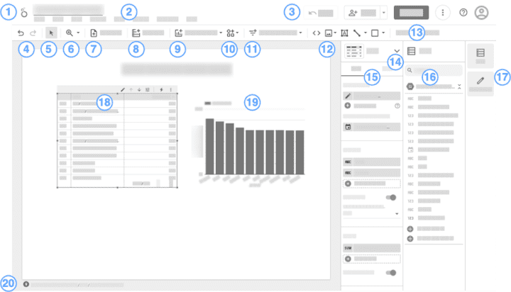
Creating Custom Charts in Looker Studio
Steps in chart creation
Creating custom charts in Looker Studio involves the following steps:
- Choose Chart Type: Select the appropriate chart type based on the data you want to visualize. Looker Studio offers various chart types, including bar charts, line charts, scatter plots, area charts, and more.
- Select Dimensions and Metrics: Determine the dimensions (categories) and metrics (values) to include in the chart. Choose the data fields that are relevant and will provide meaningful insights.
- Customize Formatting: Customize the formatting of the chart to align with your reporting needs and preferences. Adjust colors, fonts, labels, and other visual elements to enhance the clarity and readability of the chart.
- Apply Filters: Apply filters to the chart to allow users to interact with the data and adjust the displayed information based on their preferences. Filters can include date ranges, specific categories, or other relevant dimensions.
- Test and Refine: Review the chart in the Looker Studio interface. Make necessary refinements or adjustments to ensure the chart accurately represents the intended information.
- Save and Publish: Save the custom chart in Looker Studio. If desired, publish or share the chart with others, either internally or externally, using Looker Studio’s sharing and collaboration features.
Following these steps, users can create custom charts in Looker Studio that effectively visualize their data and communicate key insights.
Types of charts available within Looker Studio
Looker Studio provides a wide range of chart types that users can choose from to visualize their data effectively. Some common chart types available in Looker Studio include:
- Bar Charts: Bar charts are useful for comparing data across different categories. They visually represent the values or metrics associated with each category.
- Line Charts: Line charts are commonly used to display trends or changes in data over time. They effectively visualize metrics such as impressions, clicks, or conversions.
- Area Charts: Area charts are similar to line charts but visually represent the area between the line and the x-axis. They are useful for showing a metric’s cumulative or total values over time.
- Scatter Plots: Scatter plots effectively visualize the relationship or correlation between two variables. They display individual data points as dots on a two-dimensional graph.
- Pie Charts: Pie charts are useful for representing proportions or percentages. They display data as circle slices, each representing a category or value.
- Heatmaps: Heatmaps visually represent the density or concentration of data points. They are effective for highlighting patterns or trends in data.
These are just a few examples of the chart types available in Looker Studio. Users can customize and refine these charts to suit specific requirements and visualize their data effectively.
Optimizing chart use for Search Console data
To optimize the use of charts for Search Console data in Looker Studio, consider the following tips:
- Choose Relevant Metrics: Select metrics that provide meaningful insights and reflect the performance areas you want to analyze. Focus on the metrics that are most relevant to your analysis goals.
- Provide Context and Labels: Use appropriate labels, titles, and annotations to provide context and clarity to the chart. Explain any abbreviations or technical terms to ensure the chart is easily understandable.
- Choose Appropriate Chart Types: Select the chart types that best represent the relationship or pattern you want to communicate. Consider the data being visualized and choose the chart types that effectively portray that data.
- Limit Data Points: Avoid overcrowding charts with excessive data points, making the chart difficult to interpret and understand. Use filters or aggregation techniques to limit the number of data points displayed.
- Utilize Color Effectively: Use colors intentionally to enhance the clarity and visual impact of the chart. Choose easily distinguishable colors and ensure that they accurately represent the intended meaning.
By following these optimization tips, users can create charts in Looker Studio that effectively communicate insights and help drive data-driven decision-making based on Search Console data.
Sharing Looker Studio Dashboards
Procedures for sharing dashboards
Sharing dashboards in Looker Studio can be done using the following procedures:
- Access Sharing Options: Access the sharing options for the desired dashboard in Looker Studio. Typically, this can be done by selecting the dashboard and navigating to the sharing or permissions settings.
- Set Permissions: Set permissions to determine who can access and interact with the dashboard. Looker Studio allows you to specify individuals, groups, or teams that can view, edit, or collaborate on the dashboard.
- Generate Sharing Link: Generate a sharing link or URL for the dashboard that can be sent to collaborators or stakeholders. Looker Studio provides options to customize the sharing link and set expiration dates or access restrictions.
- Share via Email or Collaboration Tools: Share the sharing link via email or collaboration tools with the relevant individuals or groups. Provide any necessary instructions or guidance on accessing and interacting with the dashboard.
- Monitor and Manage Access: Monitor and manage access to the shared dashboard by regularly reviewing the permissions and access settings. Update access permissions as needed to maintain data security and privacy.
By following these procedures, users can effectively share Looker Studio dashboards with collaborators, stakeholders, or clients, promoting collaboration and facilitating data-driven decision-making.
Understanding sharing permissions
Looker Studio provides flexible sharing permissions that can be customized to control access to shared dashboards. Some common sharing permissions in Looker Studio include:
- Viewer Access: Viewers can access the shared dashboard, explore the data, and interact with the visualizations without making changes or edits.
- Editor Access: Editors have the additional ability to edit or make changes to the shared dashboard. They can customize visualizations, add new elements or filters, and save dashboard versions.
- Collaborator Access: Collaborators can collaborate with others, such as editors or viewers, on the shared dashboard. They can leave comments and annotations or provide feedback to enhance the analysis and understanding of the data.
- Restricted Access: Looker Studio also provides options to restrict access to the shared dashboard based on specific criteria. Users can set access restrictions based on IP addresses, time windows, or other custom parameters to ensure data security and privacy.
By effectively understanding and utilizing these sharing permissions, users can control access to shared dashboards in Looker Studio and maintain data security and privacy.
Benefits of sharing Looker Studio dashboards
Sharing Looker Studio dashboards provides several benefits, including:
- Collaboration and Communication: Sharing dashboards enhances collaboration and communication among team members, stakeholders, or clients. Users can share insights, analyses, and visualizations to establish a common understanding and promote data-driven decision-making.
- Real-time Reporting: Shared dashboards in Looker Studio can be configured to update in real time, ensuring all users can access the most current data and insights. This real-time reporting enables timely decision-making and keeps stakeholders informed.
- Access Control: Looker Studio’s permissions settings allow users to control access and ensure that the right individuals or groups can view, edit, or collaborate on the dashboard. This access control promotes data security and maintains data integrity.
- Efficiency and Productivity: Sharing dashboards eliminates the need to distribute reports or analysis files manually. With shared dashboards, users can access the most up-to-date information in a centralized location, saving time and increasing productivity.
- Customization Options: Looker Studio allows users to customize shared dashboards’ appearance, layout, and filtering options. This customization enables users to tailor the dashboard to meet stakeholders’ needs and preferences.
These benefits make sharing Looker Studio dashboards a powerful tool for promoting collaboration, enabling data-driven decision-making, and facilitating efficient and effective communication of insights.
Conclusion
Addressing the importance of visualizing Search Console data using Looker Studio
In conclusion, Looker Studio is a powerful data visualization and analytics platform that allows users to analyze and visualize complex datasets from various sources. Understanding and visualizing Search Console data in Looker Studio provides several benefits, including:
- Enhanced understanding of website performance: Visualizing Search Console data lets users gain valuable insights into website visibility, user engagement, and overall search performance. It helps users identify trends, patterns, and areas for improvement.
- Improved decision-making: Visualized Search Console data empowers users to make data-driven decisions based on a comprehensive website performance analysis. It helps users identify opportunities, optimize strategies, and prioritize actions.
- Efficient monitoring and collaboration: Looker Studio’s monitoring dashboard allows users to track key metrics and trends related to website performance in a centralized location. Sharing Looker Studio dashboards facilitates collaboration, promotes communication, and aligns stakeholders.
Encouraging further exploration of Looker Studio’s capabilities
Looker Studio offers many features and functionalities beyond visualizing Search Console data. Users are encouraged to explore and leverage Looker Studio’s advanced analytics, data blending, enrichment, and collaboration capabilities for deeper insights and optimization opportunities.
Final thoughts on utilizing Looker Studio for Search Console data analytics
Utilizing Looker Studio for Search Console data analytics provides a comprehensive solution that empowers users to analyze, visualize, and derive insights from their search traffic data. Users can optimize website performance, enhance user engagement, and drive data-driven decision-making by effectively visualizing and sharing insights from Search Console data in Looker Studio.
With Looker Studio’s user-friendly interface, customization options, and advanced analytics capabilities, users can unlock the full potential of their Search Console data and take their data analytics and visualization efforts to the next level.